Thursday, 15 December 2016

The Great Gatsby - Mise en Scene

The Great Gatsby is a visually stunning film created by Baz Luhrmann. The screenshot that I have chosen to analyse is from one of the many party's Jay Gatsby throws at his mansion. Jay Gatsby is obviously a fictional character and the creators of the film had to create a huge party that would be thrown in the 1920's.

The main part that gives away the time period is the clothes that are worn. The costumes were designed by a lady called Catherine Martin who received help from Miuccia Prada. It is mainly the dress designs and the jewellery worn by the women which is a big hint to the time period as most of the men in this scene are just wearing suits which are still worn even today.

The fireworks in the shot show the enormity of the party as there are obviously a lot. Also fireworks at the time where very hard to get hold of and extremely dangerous.

You can see the conductor on the podium with his back to the camera and the band stood off to the right and the left which suggests that there is music at this party. Again is is an orchestra rather than speakers which reinforce the time period that the film is set.

The pool, the band , the fireworks and the butlers all stood around suggest that Jay Gatsby is very rich.

There is nothing in this scene that suggests where the party is in the world.

Monday, 12 December 2016

Olympic Animation - Shot Put

Character Design

The famous historical character I have decided to use Ragnar Lothbrok or Lodbrok. He is famous due to his raids on the east coast on England and the alliances he made because of these raids.  


In myths Ragnar is referred to as a god or a godly figure. He was a Conqueror. Because of this i wanted to design him as this huge bearded man.

Main Features of a viking/How vikings are portrayed in pop culture;

- Tall strong men
- Blonde Hair and Blue Eyes
- Bearded
- Ferocious looking
- Bare Chested
- Stereotypical Viking Helmet
- Dirty

Reference Images


Rough Sketches


Refined Sketching


Blocking and Tests


Storyboard


Animation so Far


Animation Techniques

Squash and Stretch - Shot Put.

Anticipation - Preparing the Shot Put in his neck.

Staging - I am going to make sure that both the Shot and Ragnar are the clearest part of the scene so it is clear on what is the focus.

Straight Ahead/Pose to Pose - Will be using Pose to Pose Animation.

Follow Through and Overlapping - Show the speed he generated from the spin by making him continue.

Ease in and Ease Out - The character is going to ease in and out of a lot of poses such as putting chalk on his hands.

Arcs - I can use Arcs to create smooth natural looking movements in the throw and other actions.

Secondary action - Will add facial expressions to the characters.

Timing and Spacing - The animation so far is just a rough estimate to what the timing will be. I am going to refine this for each action to make sure it looks realistic.

Exaggeration - I am going to exaggerate the weight of the shot put for the smaller man so that it seems really heavy to add to the idea that Ragnar is extremely strong.

Appeal - I have tried to make the character appealing to the audience.

Sounds

Squelching sound to give the idea of wet muddy floor.

Light wind noise

Crowd cheering in background

Birds chirping

Rustling leaves

Slapping noise when he picks up Ball Man

Manly Grunts From Ragnar (Random) (Maybe)

Skin flapping noise when Ball Man Is Flying

Cracking and Dragging sound when Ball Man Lands

Thursday, 24 November 2016

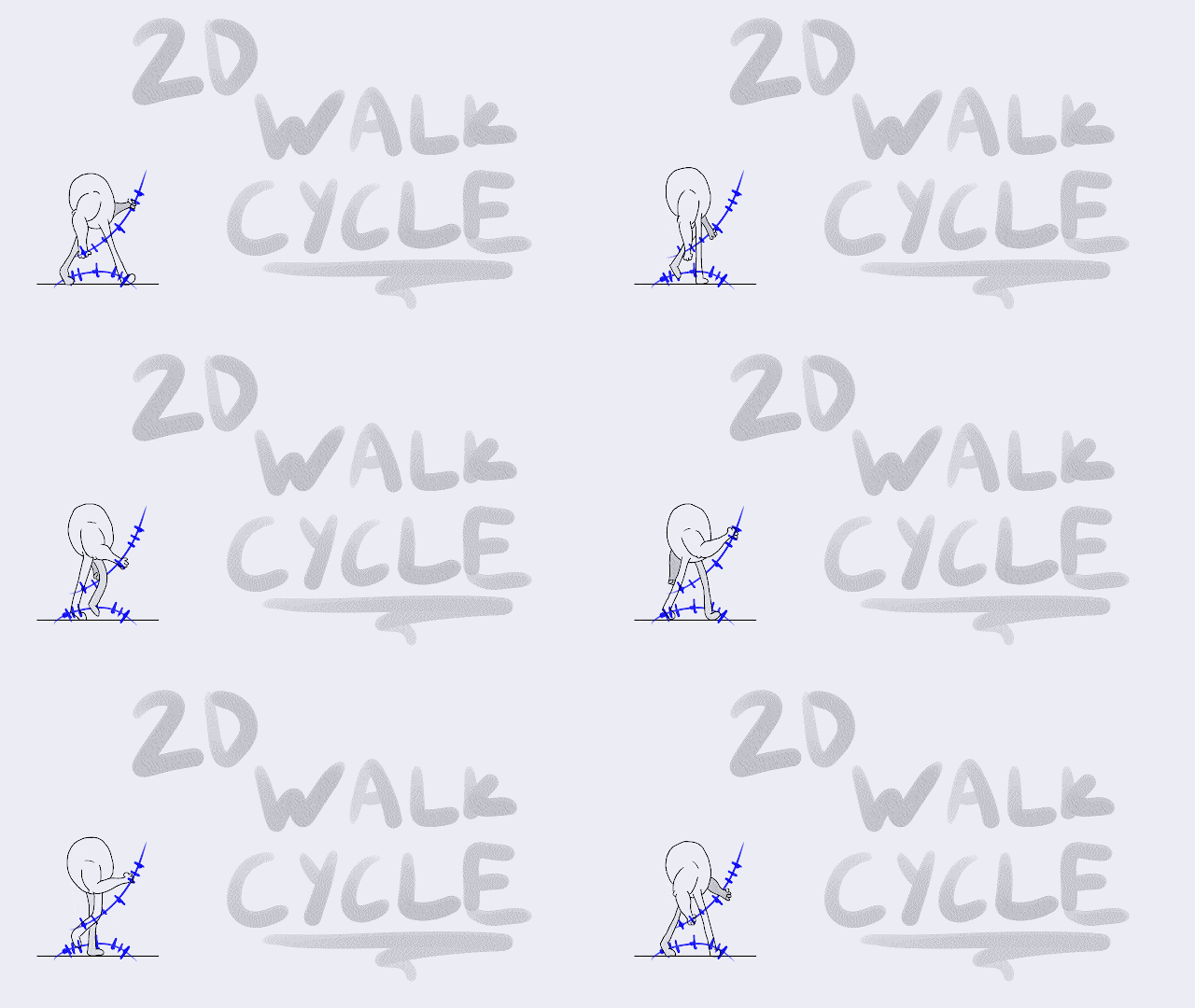
Cat Walk Cycle

Here is my second attempt at a walk cycle. I decided to try and draw it from a front view I used a reference from a fashion show hence the name 'Cat Walk'.


Tuesday, 22 November 2016

Special Effects Compositions


To begin with we had a go at recreating mars using an image from the film 'The Martian'. This image had a professional green screen setup in what looked like a huge warehouse.


Here is the dope sheet, For the background I used a 'Transform' node for the tilt feature as the ground had a harsh slope to it. I also used a 'Reformat' node to make sure the background image is the same size as the image of Matt Damon.

On the foreground image I had to key out the green screen so I used a keying tool called 'KeyLight' which is used in the industry as keying software. This didn't remove all of the green in the background so i then used a node called 'Roto' which you can use to create an alpha channel, this was very easy for a still image but might prove more difficult when using moving images as you would have to do it frame by frame.

I then used a 'Merge' node to create the final image, making sure that i connected 'A' to the foreground and 'B' to the background.


On this image I tried to make the foreground and the background appear like they where shot under the same lighting. To do this I used a 'Grade' node and a 'ColorCorrection' node. These nodes allowed me to alter the saturation, contrast and exposure of the image which i the messed around with until the two images looked similar in lighting.

I also added a 'Blur' node to the background image. this gave the final result some depth.


On this image I found it the hair extremely difficult to key. In the end I used the 'Roto' node to cut off the stray bits of hair in an attempt to make the image appear a bit more professional.


3D Minotaur Concepts


I wanted to challenge the idea that everyone had about the image of minotaur's. I brain stormed a few ideas and eventually ended up with going with a modernised minotaur. I wanted to also add a comical effect onto my ideas as well.

I looked at a few of the latest trends that have been going around and found the most stupid one which was footwear called 'Nike Sliders' which are basically slippers which you wear with socks and is socially acceptable to wear outside. I then wanted to come up with the weirdest idea for what he was going to be wearing and in the end I went with chefs equipment.

I made sure that I kept some of the defining ideas that come with the name minotaur i.e. Bull head that is attached to a Human torso, larger that human neck and big build. It is said minotaur's are extremely built (big muscles) and are very tall. My minotaur on the other hand has let himself go as he slipped in to modern society. 

Here is my first sketches on Photoshop. I feel that I can define the lines a lot more using a digital program rather that using the sketchbook. I did the initial drawing in my sketchbook then scanned it in to Photoshop and drew over the line work.


I had a go at doing some colouring and shading to prep for the texturing section of the 3D modelling. It also gives a better idea of the depth and shape of the character.


Timing Charts


Bouncing Ball

I decided to have a go at giving the bouncing ball some motion.

Saturday, 19 November 2016

Inception - Cinematography

To look at cinematography i chose to look at the film Inception starring Leonardo DiCaprio and Ellen Page. The cinematographer for the film Inception is a man called Wally Pfister who won an award for his part in the production of Inception.

Wally Pfister is known for  'frequently breaking the 180 degree rule'. His shooting style is very 'Gothic', this is very clear when you watch the films 'The Dark Knight' and 'The Dark Knight Rises' which are both films that he took the role of cinematographer.

In Inception there are some very good examples of cinematography and loads of techniques used e.g. Rule Of Thirds, Eye Line Match, Back lighting, Leading Lines and a lot more. A variety of shots are used throughout the film as well.


This image works very well. The scene is shot from far away also known as a Long Shot. The characters are positioned in the left third which creates a clear focus point. The use of back lighting brings the characters out from the cluttered background. The low angle of the shot makes the characters seem very powerful as it makes them look almost as tall as the skyscrapers in the background.


In this images Leonardo DiCaprio is positions in the left third of the scene which draws the eyes of the viewer towards him rather than the people in the background. This shot also uses leading lines very well, it seems as though the banister for the balcony is creating an arrow towards Leonardo DiCaprio's head. This shot is a medium close up shot.


This shot is an establishing shot. In this shot it appears to be using the Fibonacci Spiral. This is a great way to create a clear focus point it is the very similar to using the rule of thirds.

2016 (1990) ‘IMDb Wally Pfister’, in Wally Pfister. Available at: http://www.imdb.com/name/nm0002892/bio (Accessed: 19 November 2016).

Friday, 18 November 2016

Animation Principles

This exercise was used to teach us the 12 animation principles. These are;


- Anticipation
- Squash and Stretch
- Arc
- Exaggeration
- Ease in Ease out
- Timing
- Secondary Action


This is my second attempt at trying to use 'Squash and Stretch'. I feel that this didn't go very well, although you can see the stretch of the jaw the drawing is not very solid. The hair looks like it grows longer by the end of the gif which completely ruins the animation.


Here is my first attempt at portraying weight in animation. You can do this by using reference, for example the a feather would not fall as fast as the rock and the pencil.


On the ball bounce exercise we looked at 'Ease in and Ease Out', 'Squash and Stretch', 'Timing', 'Exaggeration', 'Solid Drawing' and 'Pose to Pose'. 


In the head turn animation we looked at 'Arcs'. For the timing on this exercise I drew the arcs on top of my initial plan and then drew the timing charts on the arcs which really helped when it came to animation the head turn.

After receiving feedback about this animation I was told that there aren't arcs in the head turn. I plan to redo this and add in a stronger arc as well as trying to keep the drawing as solid as possible.


After receiving feedback I found was told that the bouncing ball in this animation appeared too 'alive' because of this I have decide to redo this bouncing ball.